If you work at a B2B company, then chances are that you’re running LinkedIn Ads.
Or that you’re thinking about LinkedIn Ads.
In fact, based on my research, 97% of the 100 largest SaaS companies are using LinkedIn Ads.
At my agency, we’ve been having a lot of success with LinkedIn for our clients.
But just like with any Paid Social ads platform, it’s important to have great ad creatives that grab your prospect’s attention.
Here are a bunch of LinkedIn Ads examples that I’ve recently found that I want to share with you. Hopefully, they’ll give you some inspiration for your own campaigns.
And remember, one of the great things about LinkedIn is that, unlike Facebook Ads, you can put as much text in your ad images as you want.
Need help with your LinkedIn Ads? Click here to book a strategy call with me.
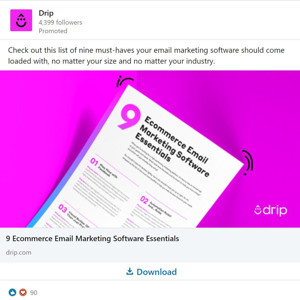
1) Drip LinkedIn Ad
In a world of bland colors on LinkedIn, this Drip ad really POPS with the bright pink color.
Their offer also provides clear value to the prospect.
I’m sure the 9 must-have essentials all happen to be features of Drip 🙂
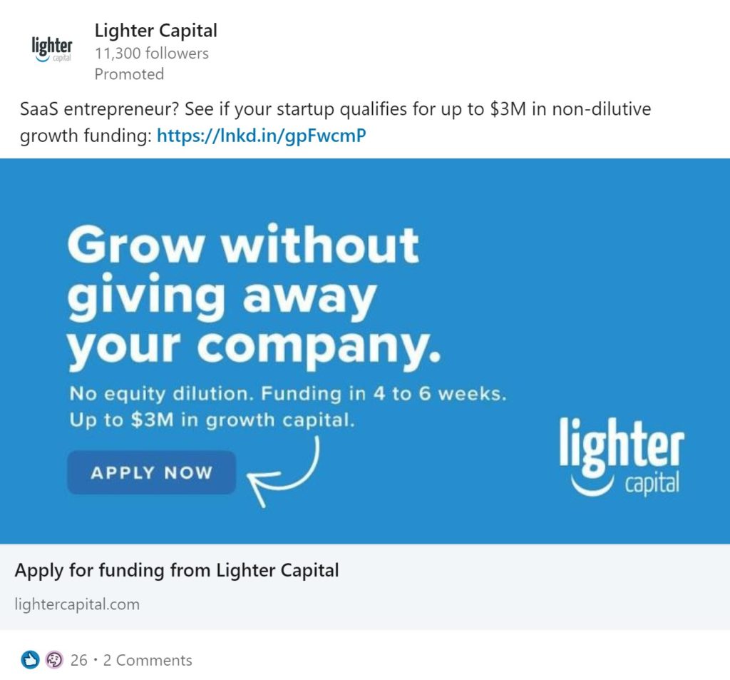
2) Lighter Capital LinkedIn Ad
I love that LinkedIn doesn’t have the same 20% text rule as Facebook.
This ad uses big, bold font to clearly communicate their offer. They use the smaller font to address additional questions or concerns that the prospect might have.
And I like the arrow pointing to the CTA button as well.
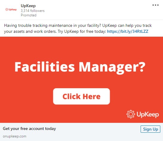
3) UpKeep LinkedIn Ad
So I gotta be honest here… this is an ad that I created for my client UpKeep.
But it’s performing great!
The idea here is to call out the job title of your prospects. The bold red color helps a lot too.
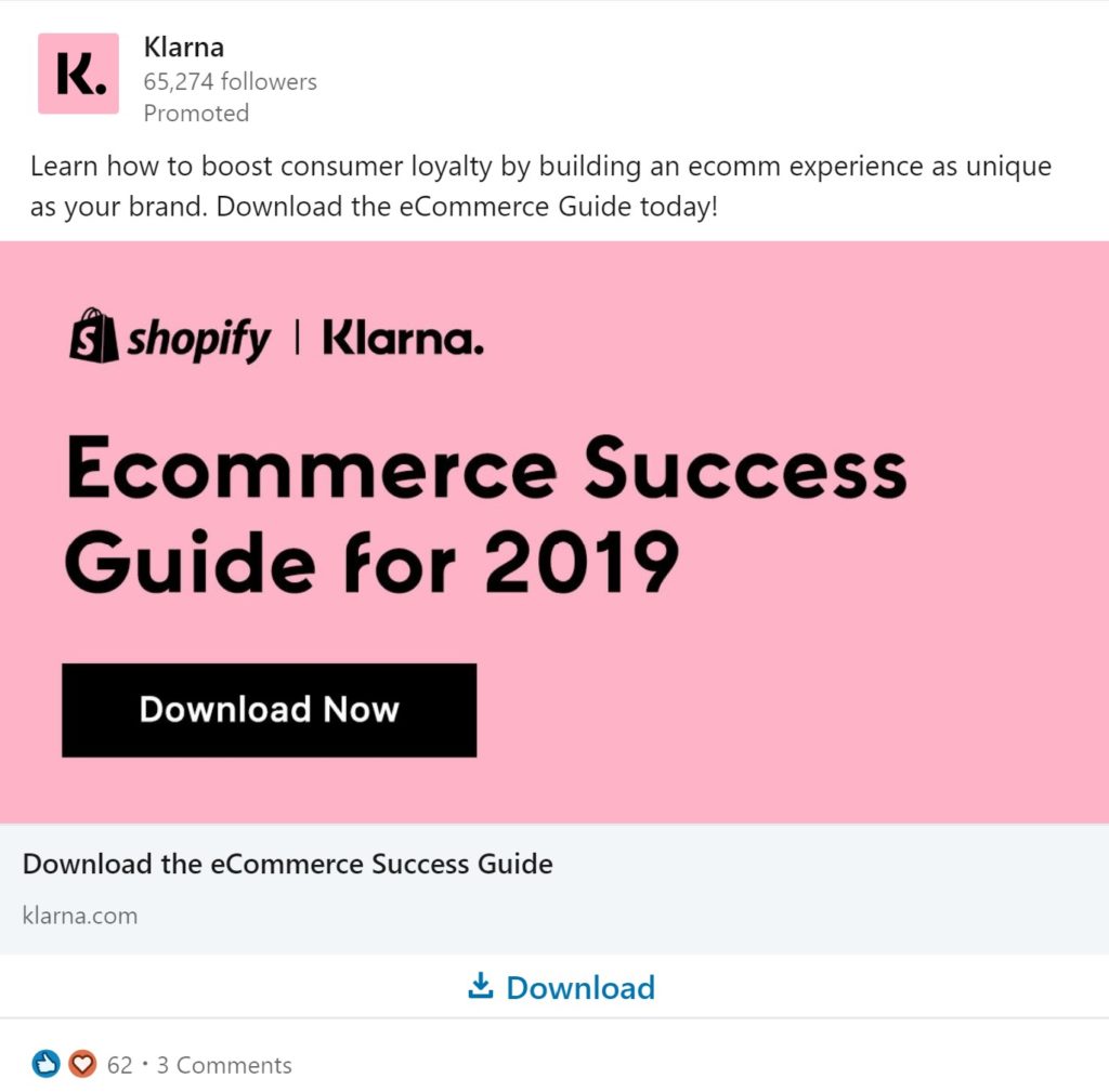
4) Klarna LinkedIn Ad
This ad uses a nice, clean layout to highlight their lead gen offer. I like the bold text and CTA button.
I also like how they pair their logo with the logo of a well-known logo like Shopify.
Looking for more LinkedIn Ads Inspiration? Click here to learn how to see any company’s LinkedIn Ads
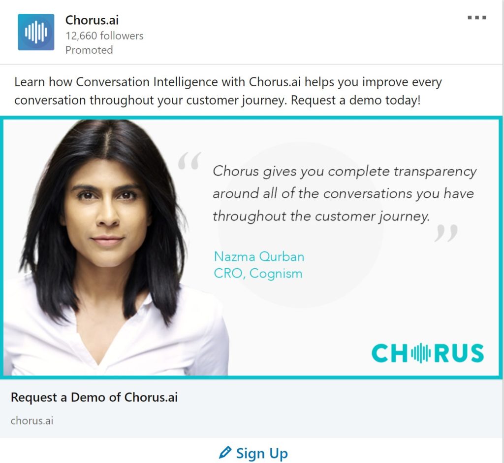
5) Chorus.ai LinkedIn Ad
Pictures of people often work really well in paid social ads. The woman in this ad from Chorus has an intense stare that grabs attention. The customer quote also provides strong social proof.
Using the headline as a CTA to “Request a Demo” is also a great move.
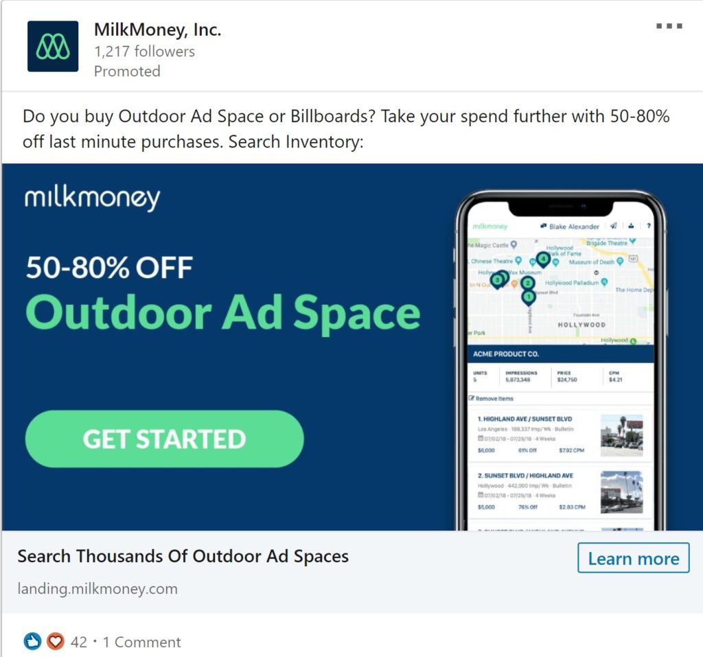
6) MilkMoney LinkedIn Ad
Bold colors and Big discounts. What could be bad?
The ad copy above the image does a great job of using a question to identify their primary customer.
Their headline text, “Search thousands of Outdoor Ad Spaces” is also very action-oriented because it makes me think that I can immediately check their database to learn more.
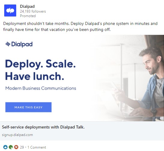
7) DialPad LinkedIn Ad
I like how all the elements of this ad work together to communicate to the prospect how quickly and easily they can start using this product.
“Make this easy”… “Deploy. Scale. Have Lunch”… “have time for that vacation”
I assume that Dialpad’s customer research discovered that prospect are concerned about implementation time so they’re using this ad to overcome that sales objection.
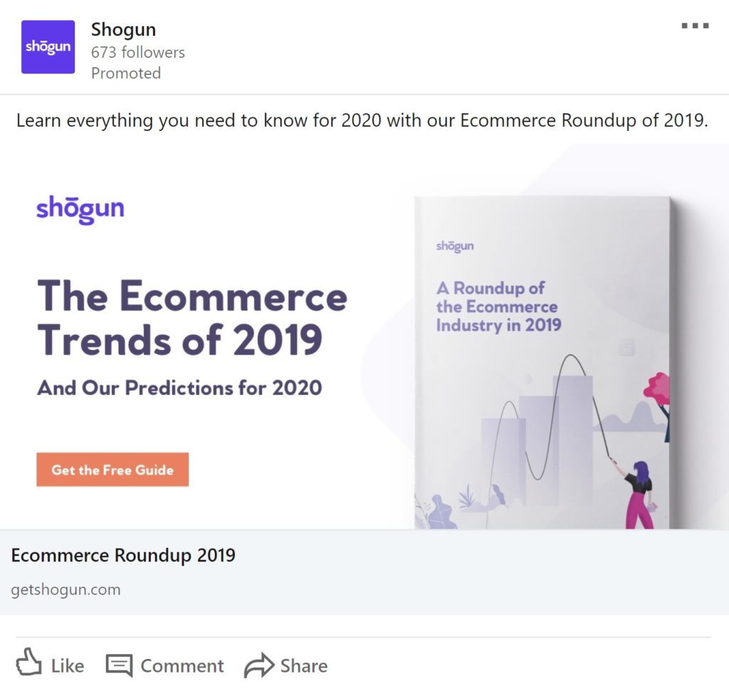
8) Shogun LinkedIn Ad
Here’s another example of a great ad for a downloadable report.
Pretty straightforward design but definitely something that you can learn from.
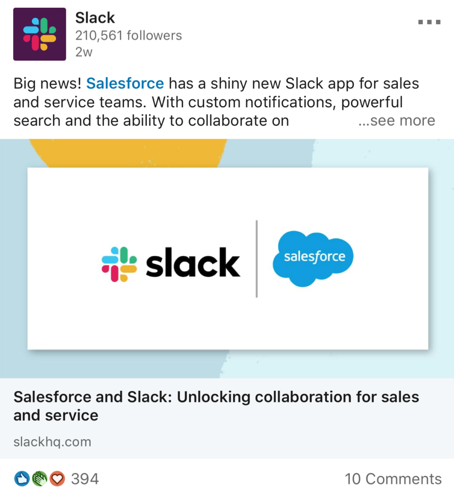
9) Slack LinkedIn Ads
Even when you’re as big as Slack, it’s often a great idea to pair your logo with another larger company’s logo like Salesforce to creat social proof. If Slack is good enough for Salesforce, then it should be good enough for you.
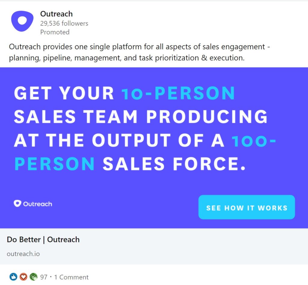
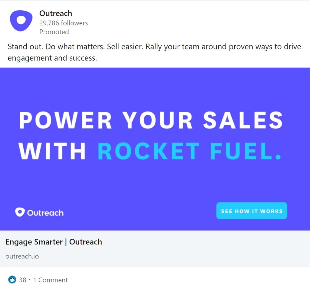
10) Outreach LinkedIn Ad Examples
These ads by Outreach do a great job of using bold text to send a clear message to their audience.
Sometimes a picture is worth a thousand words. But in the B2B world, sometimes you just need the right words to get your message across.
And a good CTR button.
In the first example, I really like how they emphasize their target customer, “10-person sales teams”.
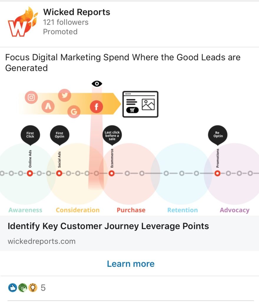
11) Wicked Reports LinkedIn Ad
Every time I see this ad from Wicked Reports I just feel the need to stop to see what they’re trying to communicate to me.
This visual representation of their product leaves just enough to the imagination that I want to click to learn more.
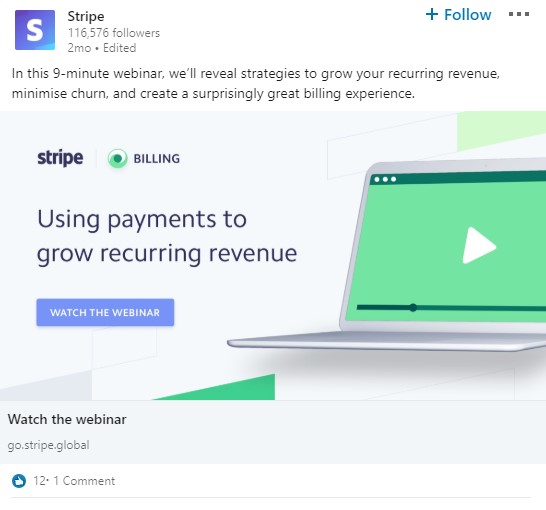
12) Stripe LinkedIn Ad Example
There are a lot of things that I love about this link from Stripe.
Their goal here is to send people to a short webinar, so their headline is a CTA to “Watch the webinar”.
The image also implies an online video that sets expectations about what’s to come if their click.
The copy above the image mentions that the video is only 9-minutes so that overcomes prospects’ fears of needing the dedicate too much time to the webinar. The copy also highlights all the valuable things they will learn on the webinar.
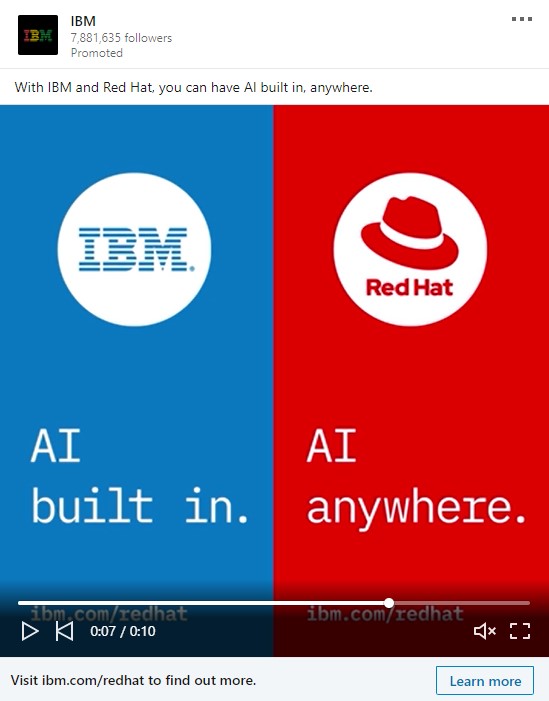
13) IBM LinkedIn Ad
I love the big bold colors here in this IBM ad. The two sides of the image could easily be used when you need to communicate two different messages. Especially if those messages complement each other.
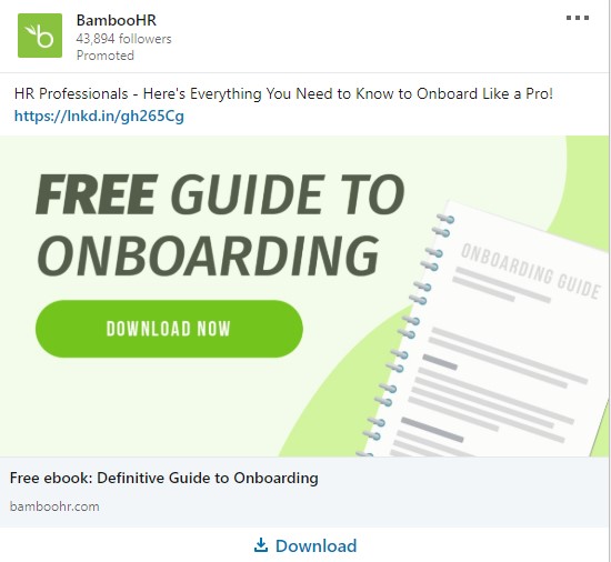
14) BambooHR LinkedIn Ad
Strong, bold text in the image with a powerful CTA button to download.
However, I would have liked if the messaging would have been a bit more clear that this is about employee onboarding. My SaaS mind immediately thought it was about SaaS customer onboarding.
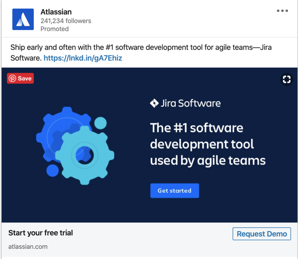
15) Jira LinkedIn Ad
Clean, bold colors and a clear tagline explaining what you do.
Simple and effective.
I also like the headline to “start your free trial”
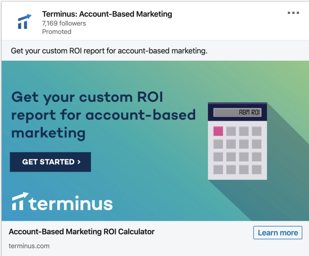
16) Terminus LinkedIn Ad
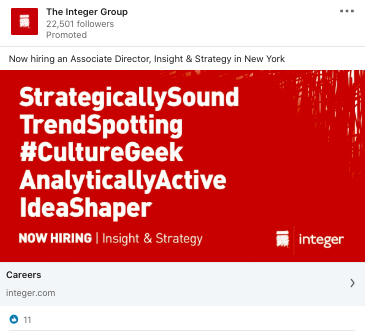
17) Integer Group LinkedIn Ad
I think it’s the bold red background color that grabbed my attention to this ad.
I like the bold text, however, the layout here does make it a bit hard to read.
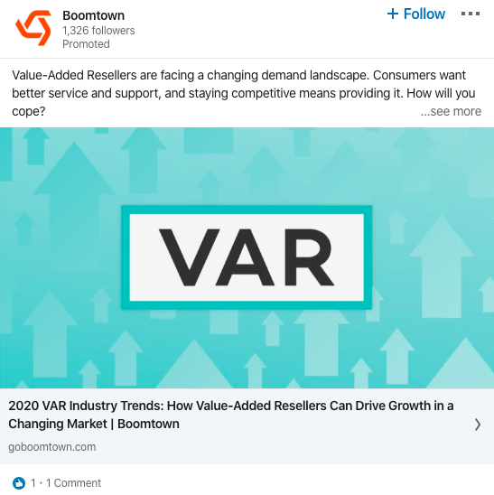
18) Boomtown LinkedIn Ad
Frequently, using a single bold word in an ad image works great when it’s a word or term that your prospects connect to.
You could copy this ad image for nearly any niche and it will work well with the right emotional trigger words.
Calling people out by job title works well also.
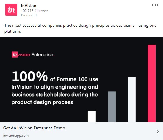
19) InVision LinkedIn Ad
This ad from InVision uses social proof together with a bold number to state that 100% of the Fortune 100 uses InVision. That’s a pretty powerful claim that their prospects can’t easily ignore. Then they use a CTA for an Enterprise Demo.
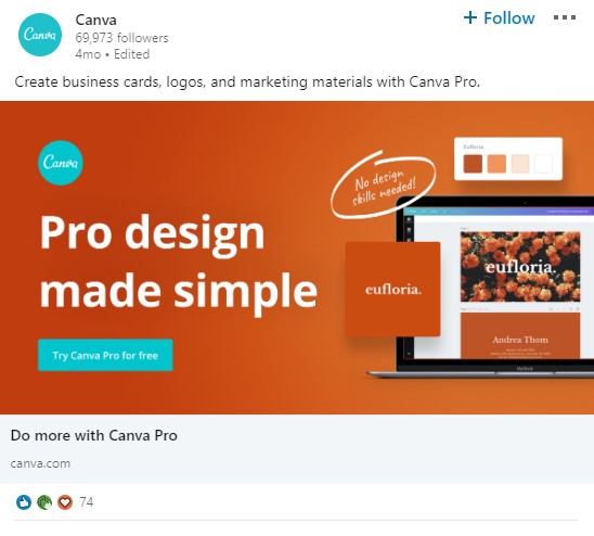
20) Canva LinkedIn Ad
This orange image really stands out with the generally bland colors on LinkedIn. And the contrasting CTA button color really makes it POP as well.
The “No design skills needed” text is powerful because it overcomes a common objection to product.
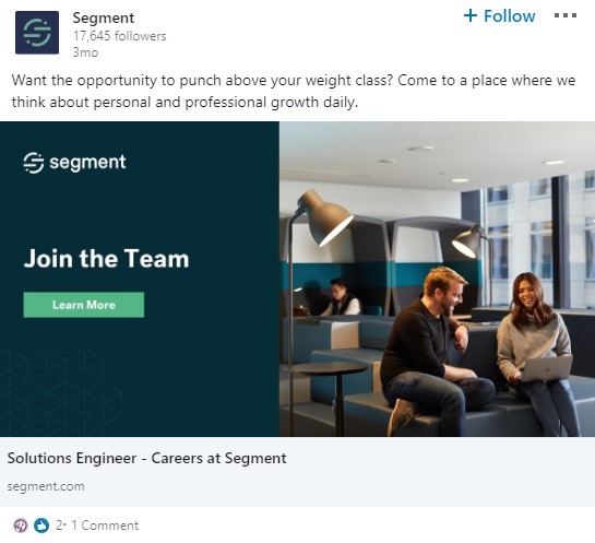
21) Segment LinkedIn Ad
One of the most common uses for LinkedIn Ads is for HR recruiting. Segment uses a clear CTA in their image to “Join the Team”
This office looks like a fun place to work. And hey look… those employees are smiling.
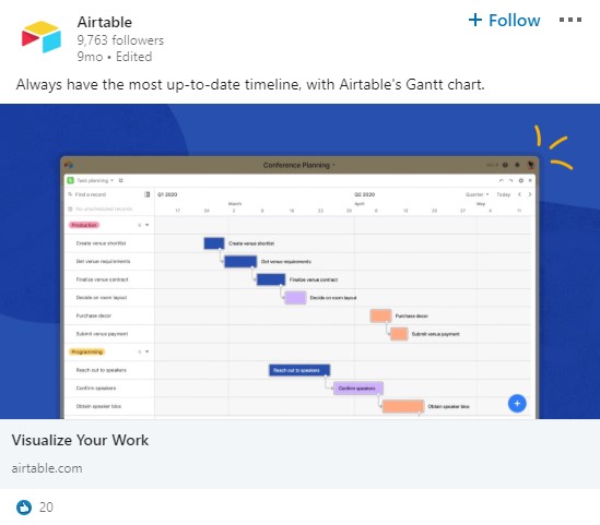
22) Airtable LinkedIn Ad
Visual representations of products are great ways to communicate how your product helps your customers. As long as the visualization conveys value.
If you work with Gant Charts, then this image might grab you.
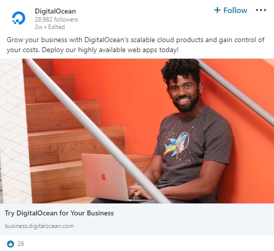
23) DigitalOcean LinkedIn Ads
DigitalOcean uses bright, colorful photos of employees in their ads together with a straightforward CTA to “Try DigitalOcean”
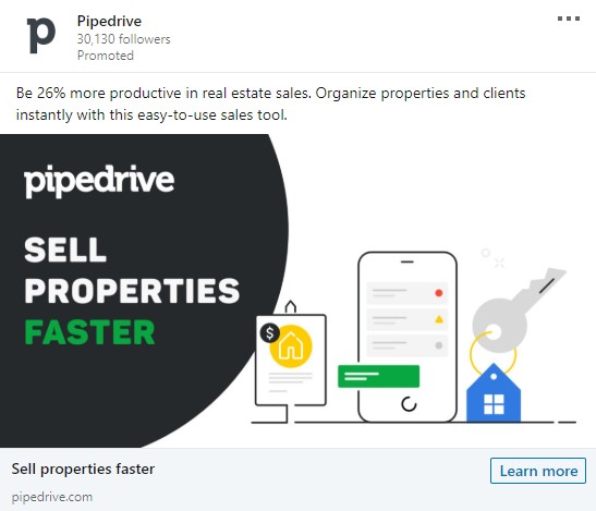
24) Pipedrive LinkedIn Ad
This ad does a great job of highlighting the main benefit that they help their prospects with… Sell Properties Faster.
What real estate agent doesn’t want that?
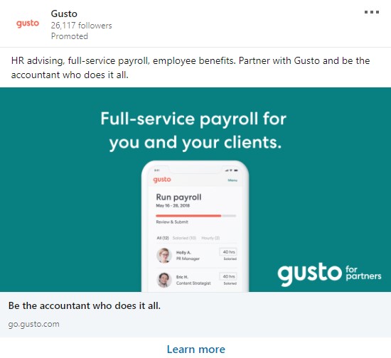
25) Gusto LinkedIn Ad
Sometimes a simple ad that just says how your product helps your customer is the best way to go. Mobile screenshots also often work well.
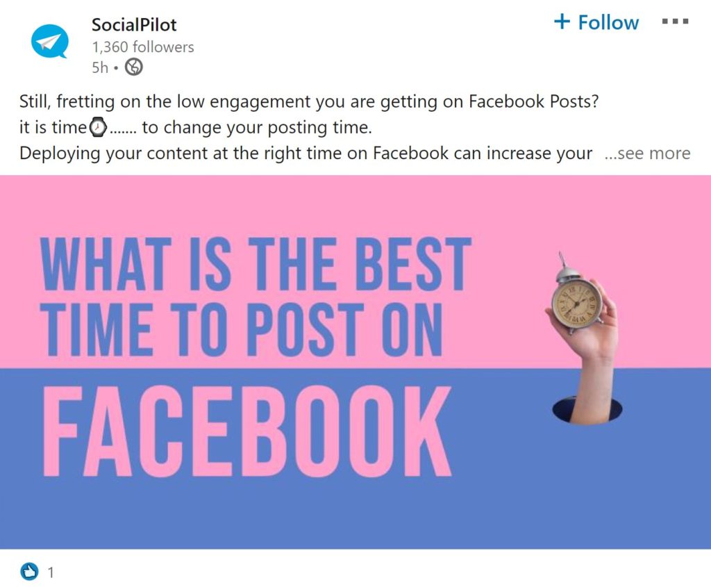
26) SocialPilot LinkedIn Ad
You never go wrong with a bright colorful background and trivia headline in your ads
The thing that really stands out with this ad is its emphasis on finding out the answer to the question
Trivia questions are always a great tool to engage your audience and help persuade them to come to a conclusion on their own.
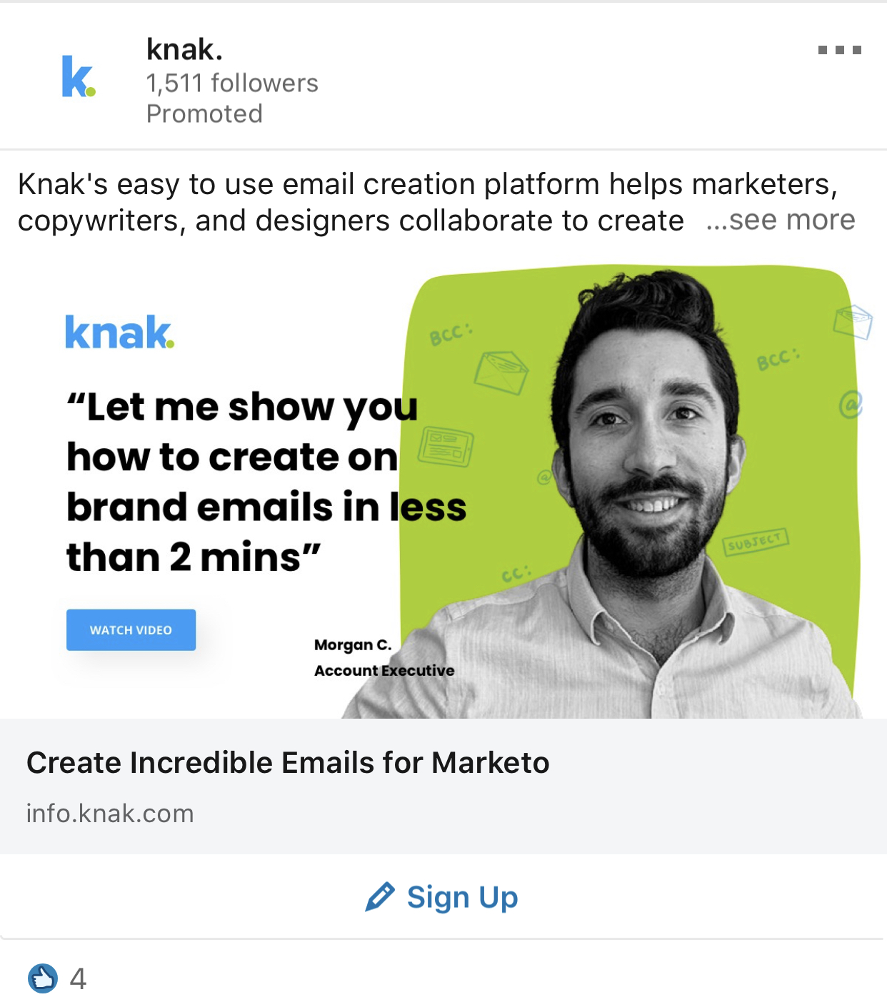
27) Knak LinkedIn Ad
The ad gets it right by demonstrating how their product makes creating brand emails so much easier
It also adds a hint of human connection by adding a picture of their account executive in the ad image.
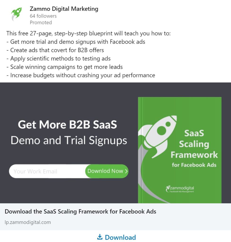
28) Zammo Digital LinkedIn Ad Example
This ad is one that’s close to my heart.
What I really love about this ad is that it clearly shows what you can get if you download the eBook.
No unnecessary fluff, just straight to the point.
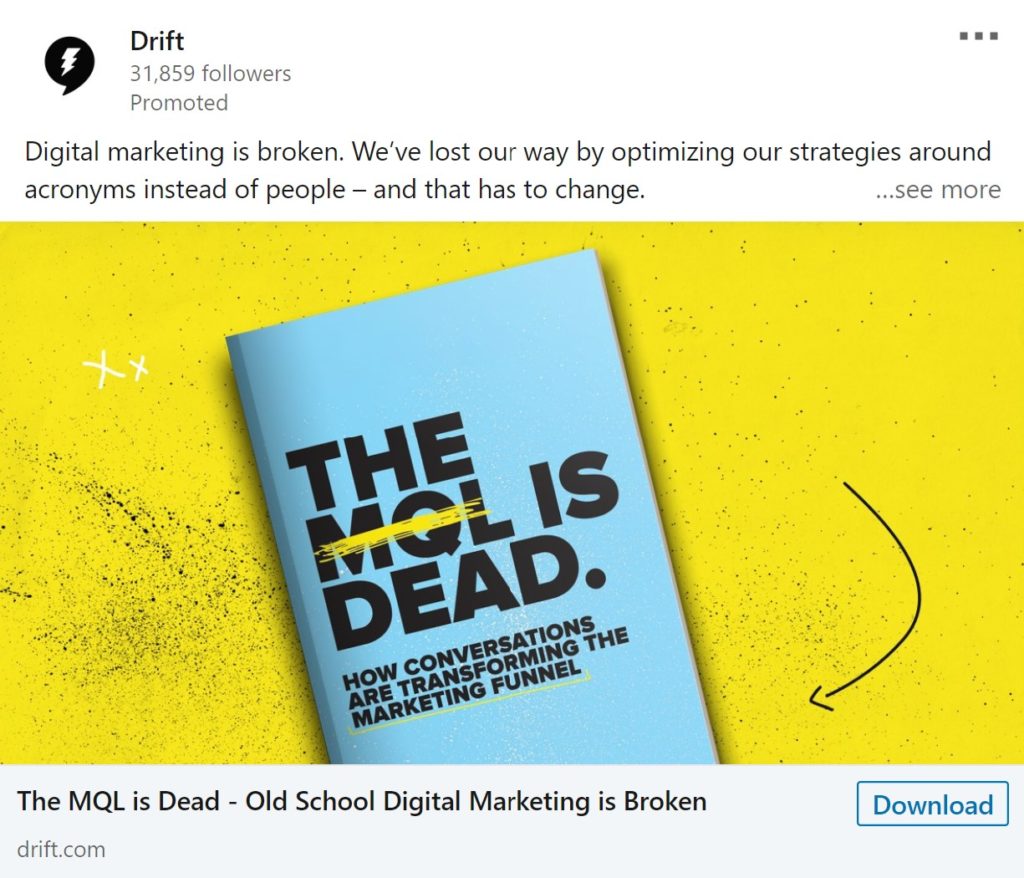
29) Drift LinkedIn ad
Controversial headlines like “The MQL is DEAD” are always a great way to catch the attention of your target audience.
The image text by Drift clearly addresses a growing concern for those in the digital marketing space and presents how conversations is the upcoming new trend to watch out for.
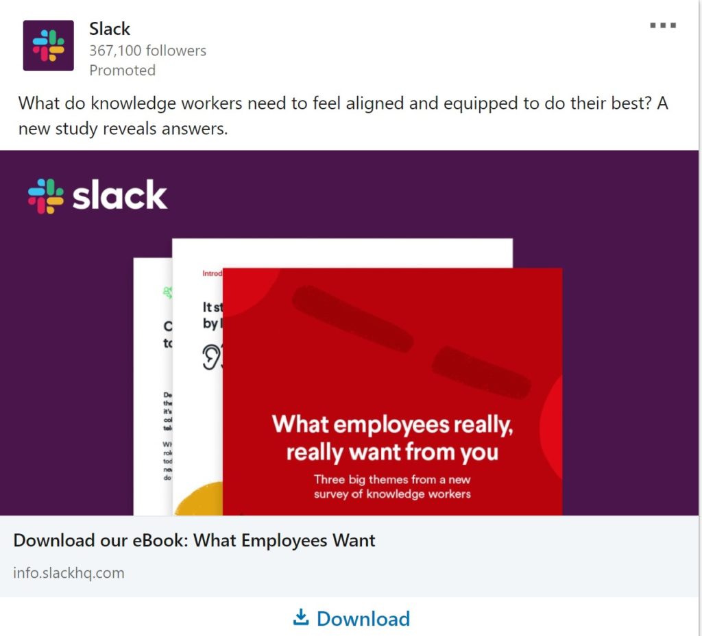
30) Slack
This ad truly wreaks of curiosity.
Right from the jump, it makes you wonder what workers need to feel to do their best in their workplace.
If you manage a team of employees, you’ll definitely be interested in finding out.
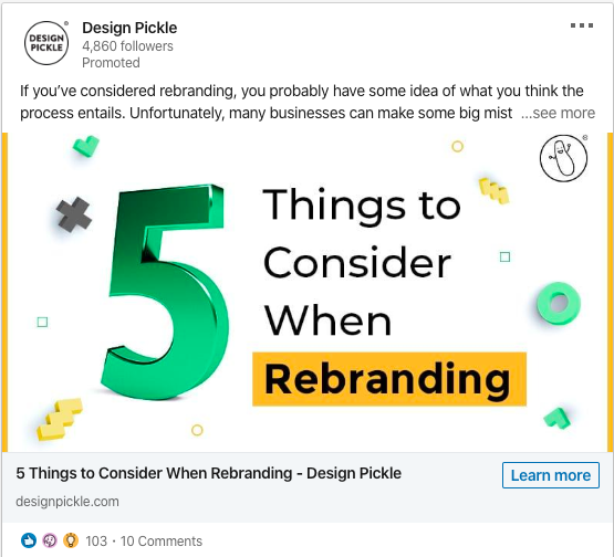
31) Design Pickle
I love how all the elements of this ad work in harmony to convey what businesses should look out for when rebranding.
I presume that Design Pickle would emphasize the number 5 in the ad image because it would make the target audience wonder if they also make the same simple mistakes in rebranding.
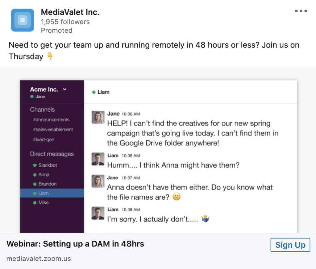
32) MediaValet Inc.
These ads by MediaValet Inc. do a great job of showing the common struggles that a team faces when accessing their digital assets from home.
Their picture captures your attention by showing real life conversations between team members and how files can easily get lost without the proper communication.
I like how they teased the problem and invited you to a webinar to help fix it.
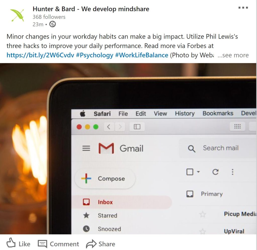
33) Hunter & Bard
This ad uses a nice, simple photo of an everyday Gmail inbox.They probably used it to point out that workers waste daily productivity checking emails.
I really like how they cleverly used the phrase “hacks to improve daily performance” to show how these methods automatically boost productivity.
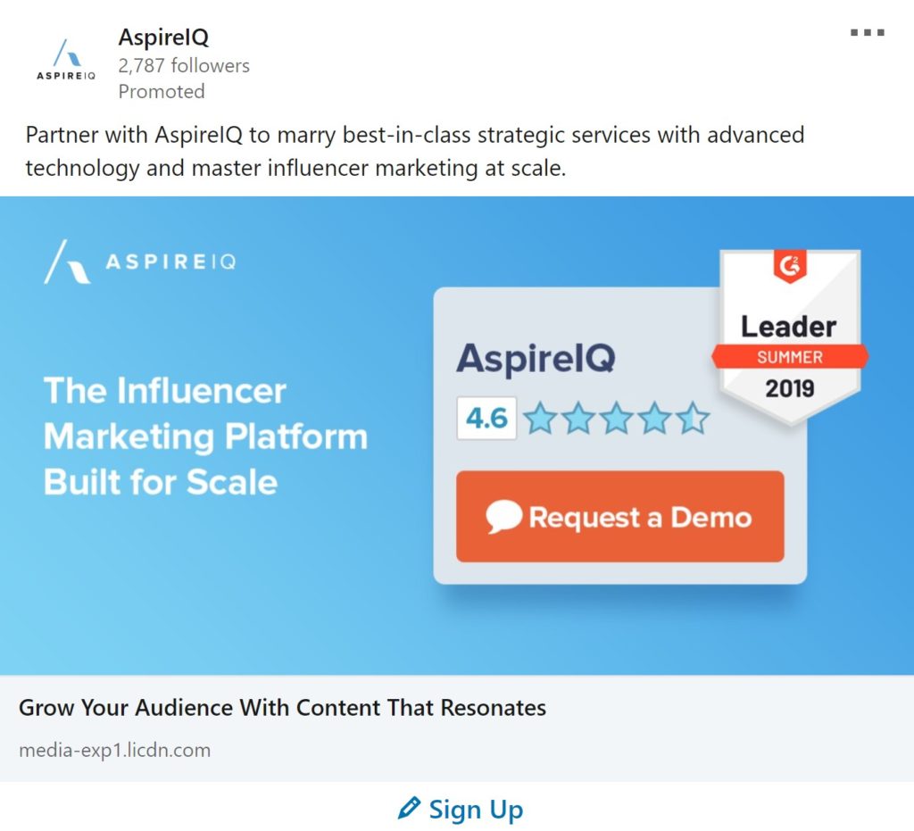
33) AspireIQ
Here’s a good example of an ad that perfectly complements their brand because it uses clean, bright colored themes.
The message is simple but at the same time highly effective.
I also like how they showed their customer rating to show authority and trust in the brand.
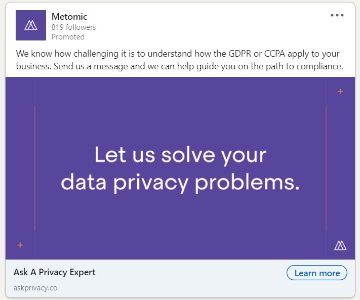
34) Metomic
Sometimes going simple just does it best.
Metomic’s ads do a great job of using bold colors and clear headlines that convey a clear message of how they can help their target audience.
The ad copy above the image does an excellent job emphasizing the challenges faced by their primary customers.
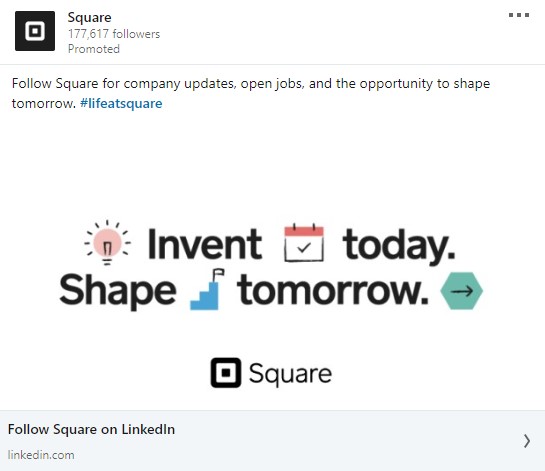
35) Square
I like how Square uses a simple tagline and a few simple icons to convey their message.
It follows a pretty straightforward design but the use of icons definitely make it easier for people to understand their brand message.
I hope the LinkedIn Ad examples above gave you some inspiration for your campaigns.
Got any examples of ads that you love? Send me a screenshot or a link and I’ll consider adding it to this post (even if it’s for your own company).
Need help running LinkedIn ads for your company? Get in touch and let’s discuss on my team and I can help grow your business with LinkedIn ads.
Pingback: 5 LinkedIn Ad Tips and Strategies for 2020 | Aaron Zakowski