If you’re anything like me, you know the frustrating feeling of finishing a beautiful ad only to realize that it has too much text and doesn’t comply with Facebook’s 20% text rule.
I can’t count how many times I have gone back and forth between exporting my ad from Photoshop or Canva, checking it in Facebook 20% text grid tool and finding that I need to adjust the placement of my text again. Then I repeat the process of adjusting the text size and placement again and again until I can get the text to fit. You know the drill.
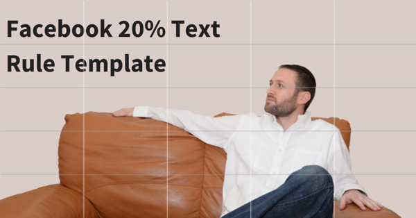
That’s why I asked my good friend (and talent designer) Yair Goldin to create a simple grid template for me so I can easily check my ad creatives before I export them. The template works as an extra image layer in my designs so I can see how my text lines up with Facebook’s grid while I’m working.
I’ve been using the templates for a few weeks and it has already saved me tons of time and headaches. Now I want to give the template to you as a free gift.


Wonderful idea! But you need to add a template measuring 600 x 600 pixels for those of us who want to create carousel adds for ebook covers.