Bonus Download: Facebook Ads for SaaS Swipe File (90+ examples of SaaS Ads)
As many of you probably know, my company, Zammo Digital, specializes in managing Facebook ads for SaaS (Software as a Service) companies. As I explained in this video, there are lot of reasons why I enjoy working in this niche.
But the constant challenge of scaling any successful Facebook ad campaign is to constantly be coming up with new ad creatives to test. In fact, I’d estimate that more than 50% of my and my team’s working hours are spent coming up with new ad ideas to test for our clients. It’s a constant struggle.
The reason we constantly need so many ads is because as you spend more on Facebook to aggressively scale your ads in front of your target market, your impressions and frequency increase and ad fatigue (aka banner blindness) sets in. The key to success is to constantly be testing new ads because usually less than 10%-20% of your ads will be winners.
That’s OK. It’s part of the process.
That’s why today I want to share with you these 10 SaaS Ads that I really like (and, yes, I’ll explain why I like then also).
Hopefully, these examples will give you some new ideas and inspiration.
#1 Oribi
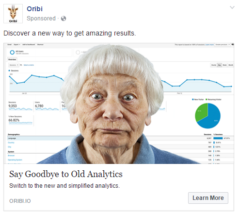
There’s something about this ad from my friend Iris Shoor‘s company Oribi that grabs me every time I see it. Obviously the old lady’s face is attention grabbing (that is the point of the image, right?), but I also like how they tie the headline copy to the image by referring to “Old Analytics”.
#2 Honey
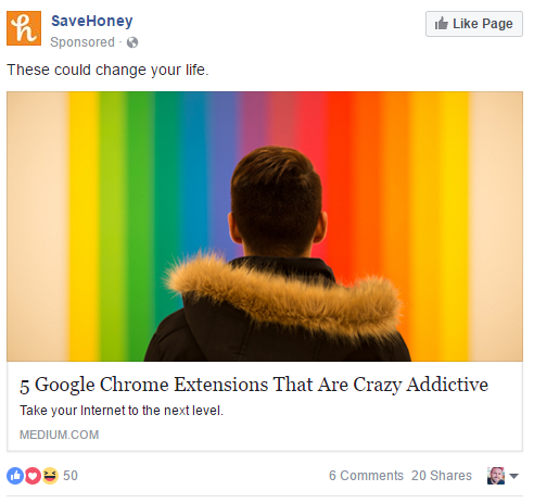
The colors in this ad from Honey are definitely attention grabbing. But what I like even more is that they are promoting their software with content. The copy in this ad doesn’t tell you to sign up, rather it invites you to read an informative article.
As an aside… I recently meet with the team at Honey at their downtown LA office and I can tell you that this is a company to watch. They are doing big things. AND… from my personal experiences, their app will definitely save you money. I recommend you try it.
#3 Mixmax
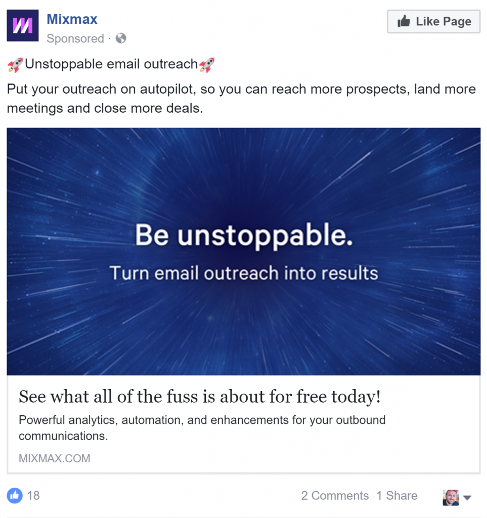
This ad from Mixmax definitely got me to stop scrolling and read more. So I just had to take a screenshot.
I love how they tie the space travel theme together between their image and the emojis. They’re also very clear about the benefits of the product.
#4 Lead Quizzes
Most companies treat right column ads as an after thought and therefore most of the ads that I see there don’t look formatted right and don’t grab attention. This ad from does a great job in the right column because of the bright contrasting colors. I also love how they use case studies for their Facebook quizzes to sell.

#5 SaneBox
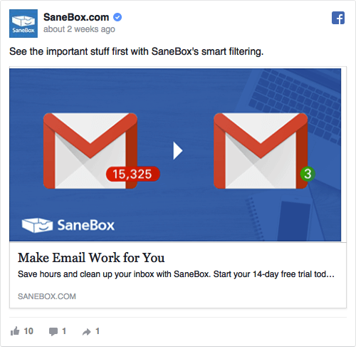
This ad from SaneBox does a great job of visually showing the value that their product provides. The bold colors also stand out on Facebook.
#6 OptiMonk
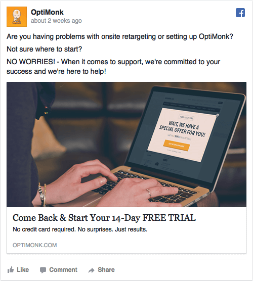
This is obviously a retargeting ad from OptiMonk. I usually don’t like ads that show a laptop with a screenshot of the product (those are sooo 2015), but in this case, it’s a perfect use of OptiMonk’s exit intent software.
Smart retargeting like this is an easy big win that every company needs to be doing even if your ad budget is less than $10 per day.
#7 Robly Email Marketing
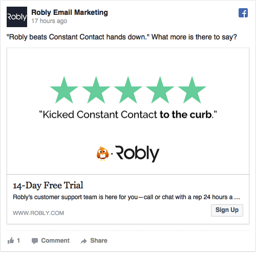
To be honest, I really don’t know what Robly Email Marketing does. But I love this ad’s simple use of customer testimonials and stars.
Icons like 5 stars are a very recognizable, visual way to communicate value to potential customer without them needing to read a word. (I can tell you that I’ll definitely be borrowing this ad concept to test for a few of my clients).
#8 Oratio
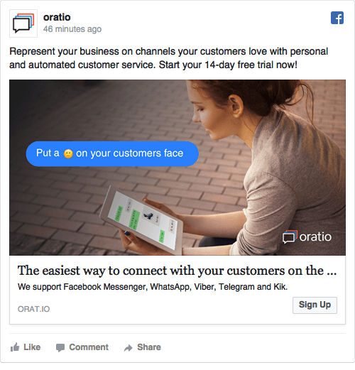
In general, I think it’s hard to get people to pay attention to ads that use stock photos of people looking at phones, tablets or computers.
However, by simply adding simple elements like text chat bubbles and emojis (things that we are now culturally trained to pay attention to), Oratio gets users to notice this ad.
How can you use visual elements like chat bubbles and emojis to enhance your ads?
#9 SalesSeek
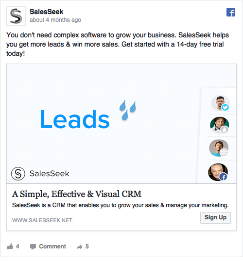
So honestly, I can’t tell you what it is about this ad that grabs my attention (probably the faces on the right side). But I find myself paying attention to it every time I see it.
#10 TheraNest
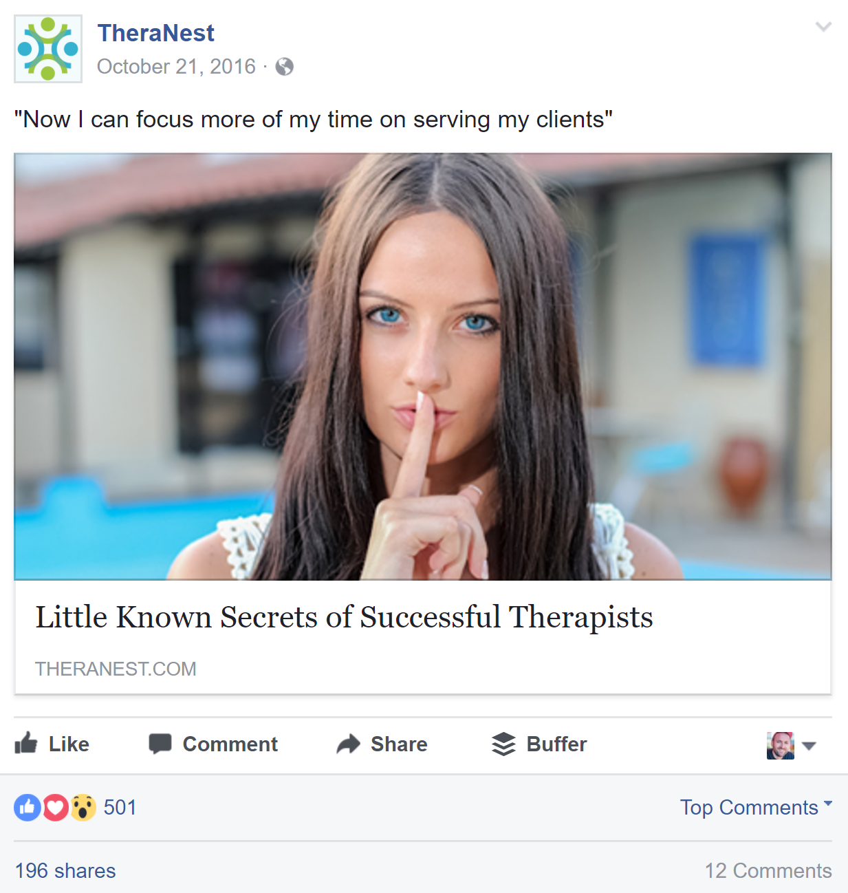
This one is actually an ad that I made for my client. My goal here was to make the ad look more like blog content rather than like an ad. The copy here peaks the reader’s curiosity because they want the results that the ad copy hints at (and the the product will help them achieve).
The result is that this ad had a much high CTR than most regular ads and a much lower CPC and CPA.
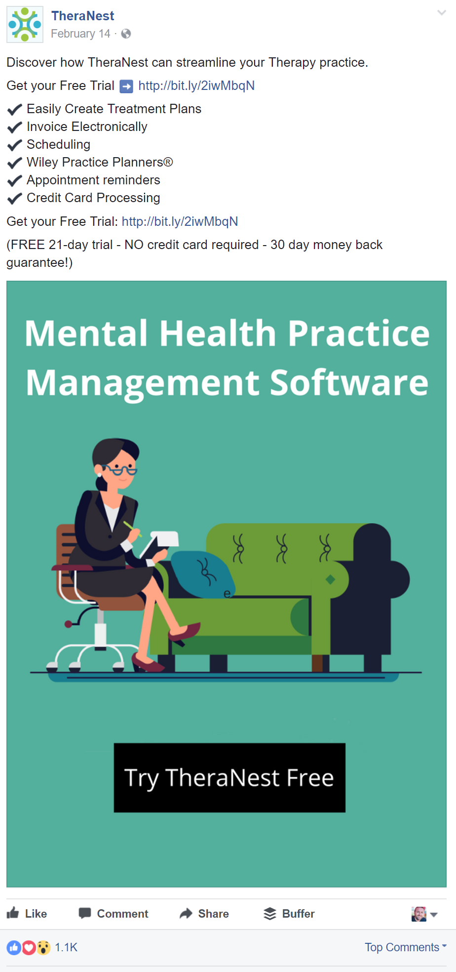
Here’s another ad that I ran for TheraNest that did very well. This ad uses a very large image so it takes up a lot of space in the newsfeed and can’t be easily ignored. The use of checks or bullet points also helps take up more space and communicates clearly to the user. It’s not included in the screenshot, but this ad also got over 400 shares.
I hope these examples give you some inspiration for your own ads. Let me know which one is your favorite in the comments below.
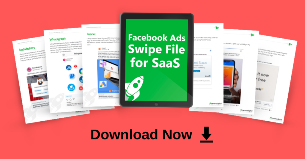
Bonus Material: Looking for more inspiration for your SaaS Facebook ads? Download my Swipe file.
Have you seen any other great ads that you think should be added to the list? Add them in a comment below or email them to me at aaron@aaronzakowski.com

Thanks for the list Aaron! In terms of conversion, how does Free vs. Paid access to softwares performs? Also what type of split testing do you use for access example with or without credit card for free trials. It would be interesting to also know cost per conversion. Thanks
Excellent round up Aaron. Been looking for some inspirations on b2b SaaS examples. Looking for more inspiration on how you cracked the digitalocean 🙂