(Post update September 2017)
A few months ago, I got call from a guy named Clark Valberg.
Now aside from being an all around awesome guy, Clark also turned out to be the Co-Founder and CEO of InVision.
If you don’t know about InVision yet, then it’s time that you check them out. InVision is a design prototyping and collaboration platform used by over 2,000,000 graphic designers and their teams (Including companies like AirBnB, LinkedIn, Evernote, and many more).
Despite the company’s huge overall success, Clark and his team were having a really hard time generating more signups via Facebook ads.
The Problem:
When InVision hired me to manage Facebook ads for them, they had two primarily goals…
First, to bring down their cost per new signup and second, to scale the campaign up to generate as many low cost, high quality signups as possible.
Challenge Accepted!
The Solution:
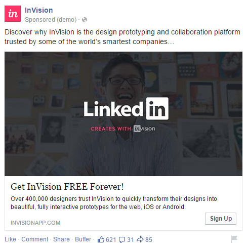
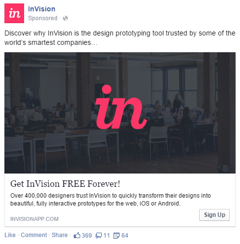
 Working together with one of InVision’s extremely talented designers, we came up with a number of great ad concepts to test (examples below).
But as I always tell my clients, the secret to Facebook success lies in proper campaign structuring, segmentation, bid management and testing.
Here is a list of four techniques that really worked well for me on the InVision campaign…
1) Lookalike Audiences
I love Lookalike audiences!
Lookalike audiences eliminate a lot of the guess work in building target audiences by letting you targeting people who are similar to your current customers.
The hard part though is finding the right data source to build your lookalike audience from. Simply uploading your customer emails and building a Lookalike audience from it is usually not enough to build a high converting audience.
For our experience working with lots of SaaS startups, we’ve found that Lookalikes based on people who triggered your primiary conversion event are usually the most effective. So for InVision, we built a Lookalike based on all people who signed up for a free trial and triggered the Complete Registration event.
They key to building an effective Lookalike is to balance the size and relevancy of your base audience. You want to start with an audience of high value users (ideally paying customers). But you also want to make sure that your audience has at least a few thousand people in it.
And don’t forget about excluded audiences either. Make sure you exclude custom audiences of people who have already converted on your site.
2) Retargeting
If you’re already paying to get traffic to your website from lots of different sources, then make sure not to let those people get away without them signing up or buying. Your retargeting list is usually the most high converting audience you can hit so take advantage of it.
In fact, in the case of InVision, the average cost per signup via retargeting was about 23% cheaper than signups from other campaigns.
3) Use the Right Side Column
Update Sept 2017: Since this article was first written, Facebook has introduced a lot of new ad placements including Instagram. It’s important to test different placements for each company to figure out what works best for you.
When working with InVision we generated conversions from right side ads for an average cost that was about 41% lower than desktop newsfeed ads. Today, we’re not seeing those same results. However, Instagram has been a very effective ad placement even for B2B SaaS companies.
If you’re working with a small budget, right side ads can be a great way to stretch your budget and get good results.
4) Dark Color Ads
As a general rule, it’s important to test a lot of different image creatives in all your campaigns. For the InVision campaigns, we found that using a semi-transparent dark gray layer over images tends to help them perform much better. I think the dark color stands out bold on in people’s Newsfeeds.
UPDATE: However for most of our clients at the end of 2017, we are finding that this dark style ad is no longer working.
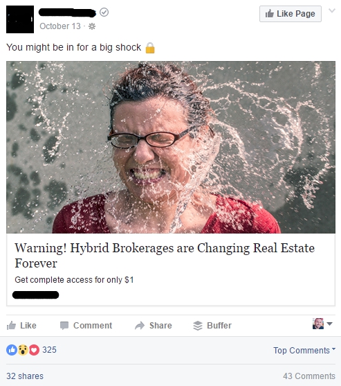
Lately, we’ve had great success creating ads that don’t look like ads. Our goal with our new ads is to make ads that look more like content posts. These ads tend to get much higher CTR and lower CPC. Here’s a great example of an ad that looks like content that has done well for use (you can read more about how we create this style ad here).
Recommended Reading: 10 Examples of Facebook Ads for SaaS
Here are a few examples of successful ad creatives that we ran for InVision.
And here’s another one…
The Results:
Success!
By the second month of the campaign, I succeeded in reducing InVision’s average cost per new signup on Facebook by 44% compared to the results they got from the previous agency that had been managing their Facebook campaigns.
Next, it was time to start cranking up the budget to increase the daily volume of new signups. After another week of tweaking, I found the sweet spot for my daily budget that provided approximately 1100% more signups per month than InVision had previously been generating on Facebook.
Now it’s your turn…
What’s working for you in your Facebook ad campaigns? Let me know in the comments below.
If you’re still struggling to get these kinds of results from your Facebook ads (or if you know somebody else who needs help), then be sure to check out my Facebook Ads Consulting services and let’s work together to create this kind of success for you.

